Monday, July 30, 2012

Hamster Humans and Hamburgers

So, I picked up this book called Animal Skulls: A Guide to North American Species by Mark Elbroch.  It's fascinating.

And that fossa skull I was working on?  Anatomically wrong on so many levels.  The most glaring flaw being the lack of a foramen magnum... which is kind of an important structure considering it's the hole for the spinal chord.

Yeah.  Kind of important.

All this just stresses the point that research should come first.

In other news, my brain was keeping me awake Saturday night wandering on "what if" tangents as it's wont to do.  I hit upon "what would my characters look like if they were human instead of rodents?"  I ended up drawing this:

Still haven't decided whether or not to color it in.

Also went out to lunch with a church group yesterday.  Epic Burger has really good turkey burgers, but I forgot to tell them to hold the pickles.  While waiting for my food, I got bored and drew this:

Pato and Lynx eating burgers.
Earworm of the Day: Changed Forever by Toby Mac. That is honestly what's stuck in my head today, and it's driving me crazy.  I can't pinpoint why, but I have a very low tolerance for Toby Mac.  Something about the background singers, or the ear-wormy-ness, or... some other factor that can't be quantified... .  Beats me.

Friday, July 27, 2012

Zoom!!!

New title image.  Yay!  For sake of side-by-side comparison:

old banner
new banner (click for full-size)
You may notice that the actual title and description are text elements of this webpage, not a part of the png/jpg image.  Though this makes composition a little more challenging, it's better for everyone in the long-run.  Search engines and screen-readers can't read text inside image files, they can only read what's in html code.

Handy tip: if you need to break the title or description in half, use the tag <br /> where you want the split to be.  Html code, allowing people to defy the default formatting since... I don't actually know when.  For other handy symbols that seem to break when punched into the blogger textbox, here's a nifty list of html codes that will make them stay put.

Earworm of the Day:  Oh, you're so going to hate me for this one... Larger Than Life by the Backstreet Boys.  I linked to the actual music video because even if the song is two decades past run into the ground, the choreography is still decent.

Wednesday, July 25, 2012

Bizarre Concept, Adorable Characters: the origin of the Jet Pack Penguins

I feel obligated to post something since I skipped out on updating Monday.

First of all, while I'm still on a digital art kick, I thought I'd revamp the title banner for Penguins with Jet Packs.  Full disclosure: the original (and as of this writing, current) banner for this blog is made from penguins pasted from a drawing I made in High School when I was going through a phase of "bizarre concept, adorable characters."

For your viewing pleasure, here are My Best Old Drawings, circa 2007:
Penguins with Jet Packs

Flying Pigs and Yellow Tulips

Elephant & Butterflies

Paradox's Den
As you can see, I was not a teen with much angst.  In fact, I think the ninja hamsters was about as dark as it got.

But yes, it's been 5 years.  I've had 3 college-level drawing classes since then.  I have a Wacom tablet now. It's time to update!

Don't worry, the penguins will still be there, they'll just be a little less...grainy.

Here is the base sketch for the new banner:
Noises like "zoom" and "whoosh" are encouraged.
Today I had stuff to do, like actual "be at x place at x time wearing a nice blouse" stuff to do.  Which is fantastic.  I love feeling like I'm getting something accomplished in the bigger scheme of things.  But it also means I have to put off completing the banner.  I hope to complete it tomorrow and have it ready to unveil on Friday.  I am setting that goal now to you, my readers.  So I better have it done.

Earworm of the Day:  Cotton Eye Joe by Rednex.  How did I get that one stuck in my head?  Blame The Nostalgia Chick.

Friday, July 20, 2012

"Facing the Doppelganger": A Process

Hold on to your hats.  This will be a long entry, but there will be lots and lots of pictures.

So Wednesday I got tired of not having a proper Facebook cover image.  I'd originally planned for a character collage, but it ran into some sizing problems and... in a nutshell, it's been languishing in half-doneness for a few months.

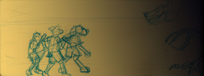
So because I felt like drawing, and inspired partly by the thunderstorm raging outside, I sat down at 9 o'clock at night and drew this:

From left to right: Leah, Beth, Marvin, and an evil shape-shifting space-alien.
The blue colored pencil is a new technique I've been trying lately thanks to a step-by-step process by Kazu Kibuishi who makes the comic Copper.  Here I wasn't utilizing the tactic of inking then removing the blue in photoshop for clean lines.  In fact, I didn't want any outlines at all for this one.  But sketching in good-quality colored pencil is much more fun for me than drawing with graphite, the wax goes down with less effort making a more readable drawing.

I scanned the above image the next morning at about 9am, then brought it into Photoshop.  Another thing I've recently learned is always start with a background color.  I chose a gradient to help my brain wrap around the light and shadows.
Background gradient and original sketch set to "Multiply".
Then I colored the base colors of all the characters and their accessories.  It must be noted this is the first time I've colored my alien character Marvin in his "Earthling" disguise (his fur is dyed black.  His natural fur-color is a garish shade of spring green.)
Character base colors.
Next I added the road surface they're standing on.  I used a speckled brush set to a really big setting to give it some texture.
Road
Then I turned my attention to the background.  I dislike drawing backgrounds, so I try to keep things simple.  For this one I needed a cornfield though, because the scene is part of a larger story and that story happens to be set in the middle of farmland.  But this is a character-focused drawing, so I decided to go easy on myself.

First, I made a corn plant:
Just realized I forgot the ears.  It's corn, trust me.
Then, I duplicated the corn.
Corn.
Then I made three more layers of corn, using rudimentary linear perspective to get the sense of rows (I did use a reference image to estimate the spacing.  I'm from the country, but I'm not that country.)  For each layer I used the Levels tool to make the corn slightly darker and the "Gaussian Blur" filter with a slightly higher setting each time to create depth.
Corn rows.
At this point, I can't remember what order I did things, but the background went something like this:
Sky with stars made using the "star" brush.
Soil gradient, layered under road and sky.
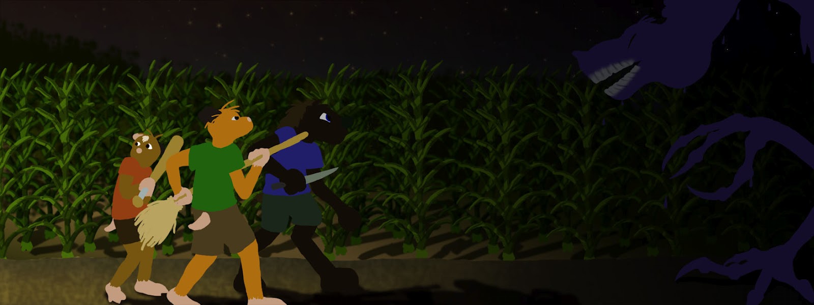
Then I stared adding shadows, which I always make with a layer set to "multiply" and a brush color set to 50% grey, then change layer opacity to taste.  Added to the corn, it made a more dramatic effect.
Shadows added to corn.
Then there was the matter of the distant hedge-rows and horizon line.  This was simply a large speckle brush of a dark green color.  I've hidden the corn so you can see it better.
The name of the game is "Suggestion", not "Detail".
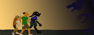
With the background elements in place, I duplicated the original background gradient and brought it between the background and the characters, setting it to "Overlay".  This gives the whole thing a nice dramatic tint.  Note that the characters are on top of the tinting layer, so they are unaffected.
Drama!
Finally, I focus on the characters.  I added the shadows in three passes for each character, that's 12 layers total just for the character's shadows in this piece.  Again, this was done with a layer set to "multiply" and a grey brush color.  The benefit to all these layers is control.  If I change my mind and want a shadow darker or lighter, all I have to do is move a dial rather than erase and re-draw.  By having shadows on a separate layer from the base color, I can lock the base color layer and play with the shadows freely without fear of messing up my earlier steps.

Grounding shadows added.
Character shadows, first pass (aka the lightest shadows)
Character shadow second-pass (darkest shadows) and extra line-work added like mouths and pockets.
Next are the highlights, which I do with a layer set to "Screen" (sort-of the opposite of "Multiply") and a brush set to the background color that I'll be highlighting.  I always mess with the opacity on the highlight layers.  This is where an object becomes either matte or shiny, which was essential for the hairless, putty-like shape-shifter alien.  Other places, like Beth's green shirt have no highlights at all.  The difference is hardly noticeable, but a good highlight will bring out the shadows more and show texture.
Highlights added.
And if you ever wanted to make a transparent character, here's the part where you hide the base color and get something like this:
I know there's a Terminator reference here, but I never watched Terminator.
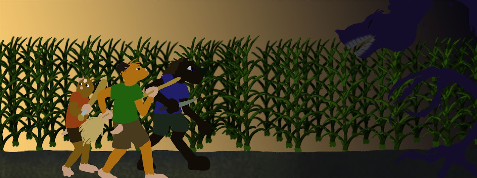
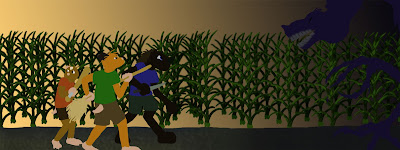
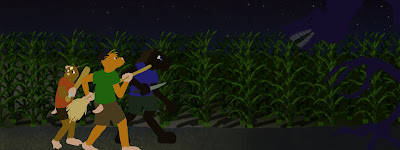
Last, I added some atmospheric effects.  A yellow-to-transparent gradient set to "Overlay" and 73% opacity gives the effect of oncoming headlights from the left.
Headlight effect.
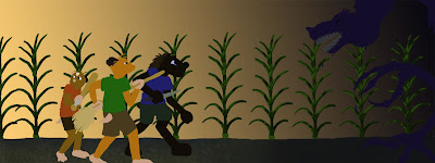
Another gradient of navy blue set to "Overlay" and 58% gave an extra aura of darkness for the shape-shifter to be emerging from.
Dark and spooky.
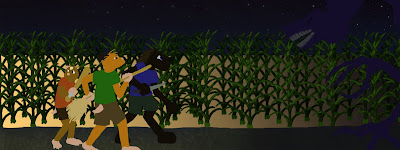
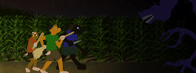
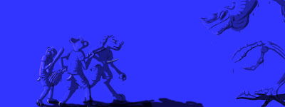
I added a grey-scale adjustment layer to check the color contrasts and to any last minute level-altering (adjustment layers filter the image without changing any information on the actual layers.  It can be turned on/off with a single button)
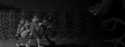
Greyscale check.  Marvin kinda... disappears.  But there's nothing for it.
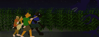
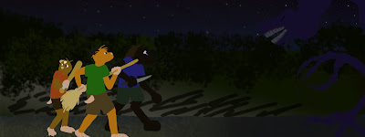
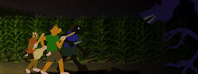
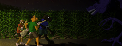
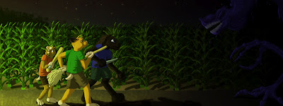
Then I exported the whole thing as a .jpg image and posted it as my new Facebook cover.  I finished at about 6:30 pm yesterday.  So with the exception of the original sketch, this really was a one-day project.  That's got to be a personal record.

Click for full-sized image.
Earworm of the Day: Tired of Lindsey Stirling yet?  I'm not.  On the Floor Take Three.

Wednesday, July 18, 2012

History and Monsters... Sort of.

Only two things I can possibly think of to blog about right now, and that's American history and Juniper Lee.


A few weeks ago I picked up possibly the most interesting history book I've ever read: American History Revised: 200 startling facts that never made it into the textbooks.  Mind you, it's not contradicting anything in the text books, this book simply adds in the missing bits.  The human factor, the dumb luck, and the minor details that made history take the course it did, and that the schools forgot to tell us for the sake of time.  Published just 2 years ago, the book covers everything from the pilgrims to Enron and does it in a categorical rather than linear order.  I found it at the library, but I'm considering buying a copy for future reference material.

Secondly, I've found the first season of the short-lived cartoon show The Life and Times of Juniper Lee on YouTube.  This was another one of those shows that I would've totally kept up with if it had been on TV at a better hour.  Now that I have 4 years education in animation and story-telling, I'm realizing what a gem this show actually was.  I love the understated reactions of the characters, and June's character animations (particularly the flipping) is very fun to watch.  (I would love to learn how to animate such a thing myself, but sadly I don't have any original characters with super-jumping capabilities).

Earworm of the Day: Electric Daisy Violin by Lindsey Stirling.  Yes.  Another one.  Hey, that's how it works.  I get it stuck in my head, it becomes earworm of the day.

Monday, July 16, 2012

Animated Animals and Mutant Food


That is a preliminary walk-cycle test for my original cartoon character, Beth.  This will be the first time she's ever been animated.  Can I get a celebratory "Whoo-Hoo"?

Too early for that?  Ok, moving on.

Went to the last day of Taste of Chicago.  I decided to be curious and daring and ate an Irish Egg-roll.  Come to find that it's essentially the unholy love-child of a spring roll and a quesadilla.  Both are up there on my favorite foods.  Neither should ever be incorporated into the other.  In terms of ingredients, an Irish Egg-roll is simply an egg-roll wrapper filled with cabbage, flecks of pink meat that were probably part of a pig at some point, and lots of white cheese.  Note that, like a real egg roll, the whole wrap is fried.

Cheese + Frying oil = Me having zero appetite for the rest of the day.

Also yesterday, we went to the Lincoln Park Zoo; which is, by the way, FREE.  I've gotten used to the turnstiles, ticket booths, and bag-checks employed by everything from theme parks, transportation, museums, and even the local public library.  So it was utterly surreal to walk of the street and right up to a grey sea lion tank with no one stopping me.  If you ever get a chance to go, do it.  No, it's not exactly Disney's Animal Kingdom, but it does have a surprising variety of critters for a zoo funded by donation.  My favorite was the takin.  I'd heard of them but I'd never seen one in real life before.  Apparently they're related to goats.  The rest of the Lincoln Park Zoo's menagerie can be found here.

Earworm of the Day: Winter Wrap Up.  Yes.  I'm serious.  I'm a female animation student that spends a lot of time on the internet, it should not come as any surprise that I watch MLP.

Friday, July 13, 2012

Geeking Over Movie Trailers

At long last I am making progress on the rigging of my CGI character Dripbird.  As of this writing he has controls to make him blink, look at things, raise/lower his crest, bend his neck, lean his body back and forth, and move his legs and feet.

Screen-cap of Dripbird rigging in progress.  The control shapes are a little hard to see.

I am still not happy with the controls for the legs and will probably re-do them (It is not unusual for me to repeat a step 3 or 4 times before deeming it worthy of keeping).  This build continues to be a lesson in problem-solving and info-gathering as I am doing this on my own time and without the guidance of a professor.  That, and all my old text-books only show how to rig characters with plantigrade feet.  They do not address how to rig a digitigrade character, which seems to be a horrible omission considering everything from horses to cats to dinosaurs walk on their toes.

I also re-did the UVmap for Dripbird because that's another thing I was unhappy with (and I do believe this was my 3rd go at UVmapping this character.)  With all the mapping I've been doing lately, the new map for Dripbird was relatively quick to assemble.  It took somewhere between 11/2 to 2 hours to complete, which might be a personal record for mapping on a character this complex (mind you I had also hit the "smooth" command already, so there was 4x as many polygons to deal with as well).
A render of Dripbird standing in a very harsh lighting (sorry about that).
In other news, I've become fascinated with 2 movie trailers, both large-scale CGI stories: Epic and Rise of the Guardians.  Rise has got me the most interested of the two, which requires some analysis because I hate holiday movies.  Ok.  I don't actually hate them, but I seriously dislike them because they tend to be simplistic, cheesy, predictable, and impart empty aesops.

But look at the trailer for Rise of the Guardians.  Seriously, go click the link, I'll give you a few minutes.

You back?  Good.

Holy cow! This is freakin' awesome!

I shall make a list:

  1. Jack Frost's character design is a barefoot kid in a hoodie.  Instantly likable.
  2. The Easter Bunny is Australian.  It took a day or two of pondering before it totally makes sense. (But it totally makes sense.)
  3. Santa is a more traditional European "Father Christmas".  A big, burly lumberjack dude with a thick accent and a big fur coat.  Much cooler than a fat guy in red saying "Hohoho."
  4. They appear to be fighting a guy who gives kids nightmares.  Nighmares.  Not "threatenting to cancel Christmas".  Not a story about "that one kid who didn't get what he wanted under the tree".  No.  A guy who invades kid's dreams and turns them into visions of 4 horseman and hellhounds.  An actual super-villain in a holiday movie.  Now this I've gotta see.
As for Epic.  Well, I have to admit it's visually beautiful, but I think 90% of the awesome comes from the sound-track.

Wednesday, July 11, 2012

Psychedelic Fossa

So yesterday I finally got back into the computer lab and worked more on the fossa skull I've had on the back-burner.  The modeling is completely done, save for the addition of some smoothing.
Rawr!

Also, for your enjoyment, I hunted around YouTube and found a video of a fossa.  It's kind of cute with it's big eyes and round ears.  But holy cow, that tail just goes on forever!  It's half the body-length or something.

Also finally got around to getting a UV mapping grid to work with.  Besides the pretty colors, the extra lines help flaws in the mapping to stand out better and the numbers show if the normals and/or UV's are facing the right direction.  The website I got it from has a whole bunch of these in various color schemes.  It's very nifty.

It's hard to look at, I'll admit.
This is my 3rd try on mapping that part of the skull.  I think I'm finally getting the hang of mapping organic forms.  The shapes are never going to be nice and simple, but as long as they look good.

Earworm of the Day: Mess of Me by Switchfoot.

Monday, July 9, 2012

Pipe-Cleaner Mouse

When I'm bored, weird stuff starts to happen.  Like pipe-cleaner mice:

pipe-cleaner mouse sitting on my laptop
What website he could possibly be interested in, God only knows.
In other news, I've found a solution to my concerns about my laptop overheating.  And it didn't cost me a dime.  It did cost 9 pencils and some tape though...

Home-made laptop cooling board thing

Yes, I decorate things with stickers.
Amazing what you can do with random office supplies.

And finally, an update on the Tiger Swallowtail butterfly model:

Revised upper-wing coloration.
Lower-wing coloration.
You may be able to see that the blue spots now have dots instead of a smooth-shading gradient, which more accurately mimics the real butterfly's markings (at least I hope so).  This was achieved first by panting the areas to be speckled completely black, then going to Filter > Pixelate > Pointillize.  This gave me a layer of black dots on a white background, which I then set to "Multiply" mode and did some light erasing to create some variations and gradations.  I was very pleased with how it turned out.

And I apologize to any lepidopterists out there who might be puzzling over the gender of this butterfly based on the markings.  I started off with a male reference, but once it got to the underside of the wings, I was just looking for any photo with a good angle to draw from.

Earworm of the Day: Escalates by Falling Up

Saturday, July 7, 2012

Fuzzy Wuzzy was a Sphere

So currently I've been teaching myself how to use fur in Maya.  And by "teaching myself" I mean using a mixture of Google searches and the "What does this button do?" technique.  Maya fur is easy to add and easy to mess with, but I couldn't figure out how to map on a multi-colored texture.  It was driving me nuts.  So I looked it up...

... one button.  That's the only step I was missing.  One.  Button.  The label reads "Bake".

So in celebration, I made Ferdinand Fur!
Cartoon fur taken to it's ludicrous extreme.
Then I backed up to a more realistic pattern and tried a proof-in-concept for a future project.  Thus the Fuzzy Hamster Fun Ball:
Half burry it in pine chips and no one can tell the difference!
Earworm of the Day: Transcendence by Lindsey Stirling.  It appears I've become a fan.